Accessible style guide for client
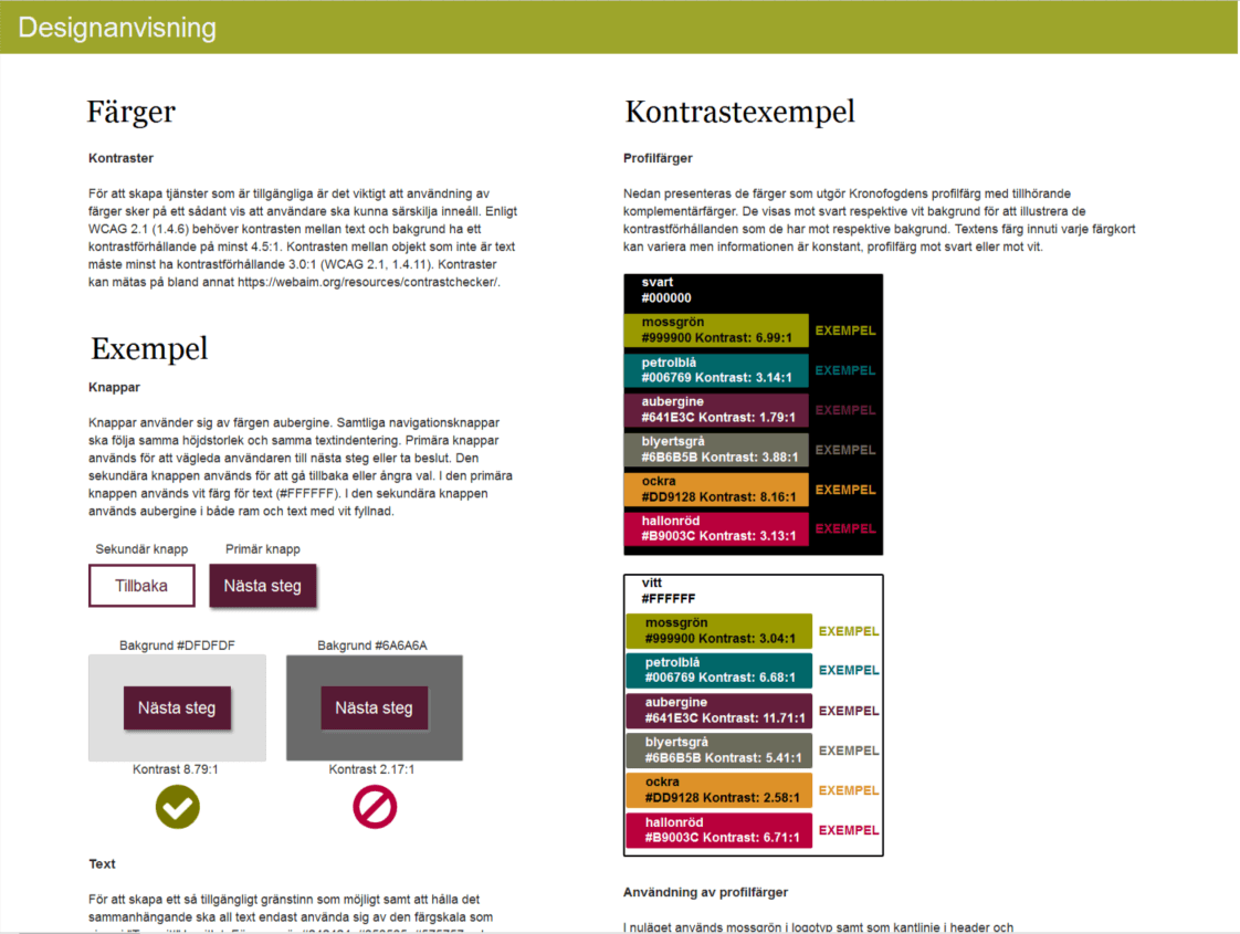
In this assignment I was tasked with creating a style guide for a large client’s external web services. They needed their style to be recognizable as their existing brand and it had to be accessible according to WCAG web standards. It was an intense project that was a lot of fun and I was sitting with a great team at their offices.
TL;DR
Summary
The customer wanted to have a style guide for their online products. The style guide would show how to create interactions, use colours, writing and much more.
Outcome
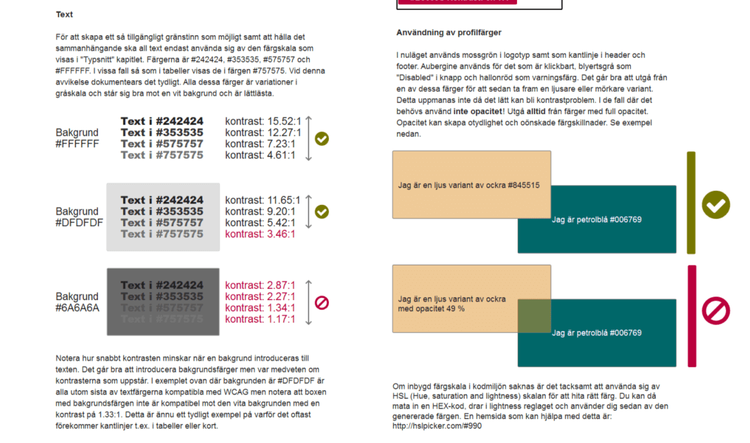
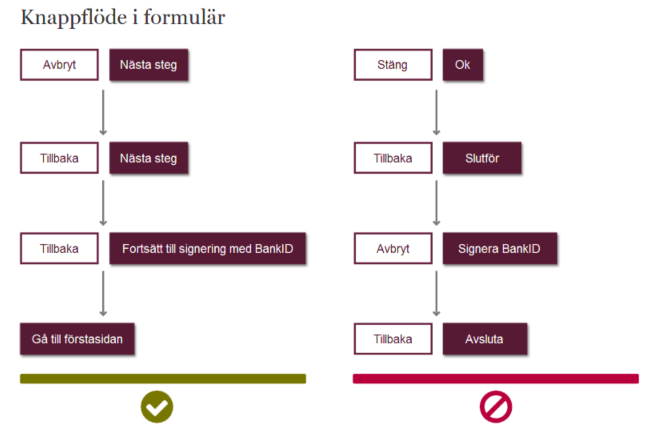
A comprehensive, detailed guide created in Axure, everything inside was focused on accessibility and helped the client to develop and maintain their products with an accessible and logical structure.
- Timeline: 2018
- Roles: UX Designer, Researcher, UI Designer
- Tools: Axure RP, Accessibility, Visual design
My role
Exact title wasn’t discussed and isn’t important to me, but somewhere between UX Design and Art Director would be a good indication. I was presented with all existing documentation, mostly for print designs, and their current profiles colour palette.
My task was to apply this palette, tweak it and create a guide explaining how all their applications should be constructed. This included concrete examples of layouts, typography with fonts and spacing. It also included guides how to create an accessible and user-friendly forms and tables.
Results
The project resulted in a large and thorough guide that developers use to create accessible and a uniform design. I learned a lot about WCAG rules, selling design to stakeholders and to work in a tight agile team.


